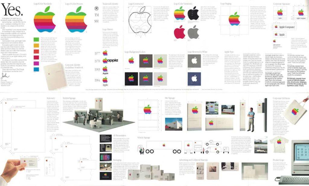
That’s a great picture isn’t it?

In the past, the objective of the brand manager was to create a process of communication based on consistency and repetition; and the goal of the designer was to create a look and a voice for that process, what we all know as the brand identity.
Back in the 80s and 90s you knew where you were with a brand. They had structures and rules, like the classics, American Airlines, Mobil, Fiat, Shell. And it made sense. Designers looked for simplicity and consistency in order to make the most of what repro and what channels were available. The marketing manager in turn looked primarily for control; for an identity defined and delivered in as managed a way as possible. Safe in the knowledge that “if my logo’s out there, I’ll know what its doing.”
But business today is a test of agility, adaptability and innovation. The age of the static brand is coming to an end. Organisations, companies, even charities are realising that having identity schemes that ‘flex’ and adapt to circumstance are more appropriate in the multi-channel, multi-lingual world that brands now inhabit.
A symphony of media.
Modern marketing communications is a much more fluid and diverse process than it ever used to be, bursting with a symphony of electronic media and display capabilities. The modern brand identity must reach out to this world, beyond traditional channels like print or TV, and interact with its audience across a multitude of platforms in a multitude of different ways.
Therefore consistency and control — while still desirable — are not necessarily the main objective of the modern brand identity. In fact, in today’s fragmented media world, such control is if not impossible then much much harder to achieve.
The forces that are driving this change of approach are undeniably modern, but it’s not as though we couldn’t have seen it coming. As long ago as the 70s, Boston’s WGBH TV created a multi-channel, multi-sting approach for its logo. But in truth, it wasn’t until worldwide brands, like Google, started to regularly play with their logo that the dam was breached and the gate well and truly opened.
Controlling what can be controlled.
Increasingly there are numerous examples of this approach, from Landor’s city rebrand of Melbourne featuring and ever-changing logo to Wolff Olins recut ident for PWC, a scalable identity that uses shifting panes of color to adapt and fit any space or medium.
North used a combination of techniques in their rebrand of the Barbican, the brand guidelines introduced a “flexible application” of the logo which was followed up with a strict grid structure that matches Shell’s new global identity system.
But the most obvious example of this approach is Google. They’ve taken their logo and created more of a system than a design that can adapt and respond to important dates or topical issues without compromising the intelligence of the idea or the quality of the service behind it.
“It is clear that the days of the monolithic guidelines manual are coming to an end. Todays brands and their identities are now being defined as much by technology and their own customers as by the companies themselves.
Will we see a return to the old-style, static monolith brands? Well, yes, possibly – if flexibility becomes the new norm then of course inflexibility could well become attractive again.
But for now, the benefits of developing fluid, flexible systems to encompass everything from fonts, to colours, to words, to images, to logos it seems, are no longer in doubt.
Increasingly being seen as important weapons in the battle for customer loyalty, with a good idea and sound application, an organisation now stops being about just a logo and gains a complete visual and verbal language with which to talk to its world.
