Branding and Graphic Design Case Studies from Sable&Hawkes
If you like what you see just click to say hello:
07712 270198 \ adrian@sableandhawkes.co.uk
Project deliverables: Brand positioning, corporate identity, brochure, logo design and advertising
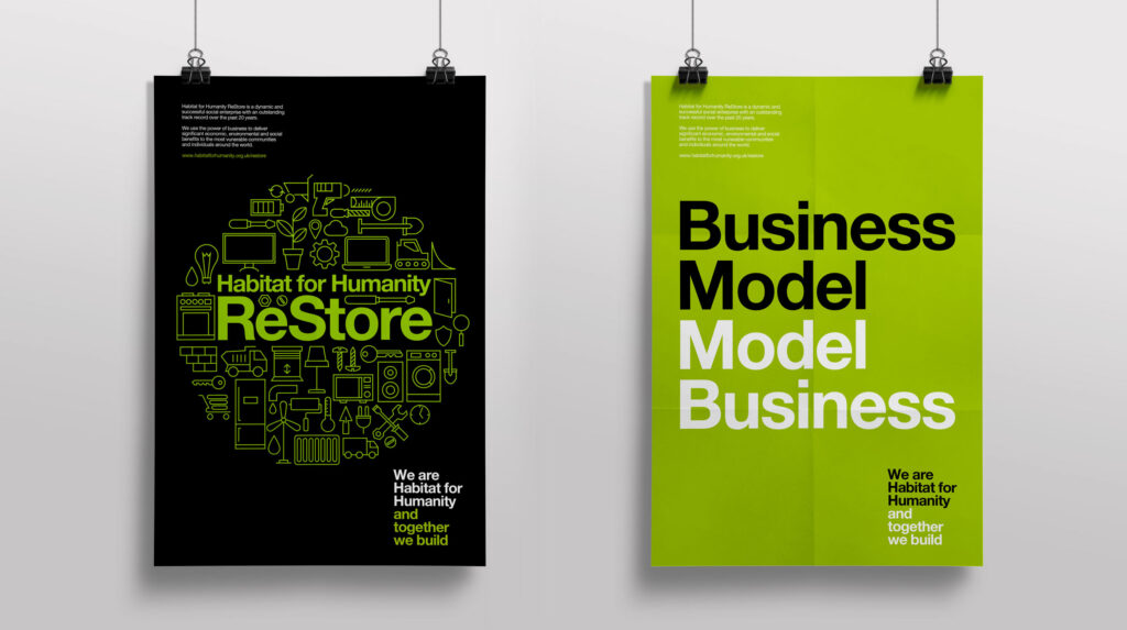
ReStore is a social enterprise charity that recycles building and household materials and sells them to local communities at a fraction of the usual price. Sable and Hawkes were asked to create a new brand, visual identity and guidelines for the charity which included a logo, delivery of marketing materials such as brochure, fliers, advertising, event, environment and livery graphics and graphic illustration style, and to then apply that in a consistent way to their marketing communications including tone of voice guidelines and creative and business copywriting and then across designed marketing and publicity materials.


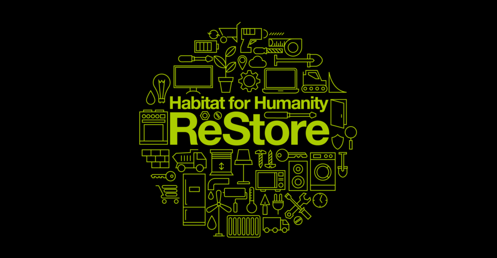
We started with the big idea – creating a brand positioning statement profit with humanity. We then designed a distinctive new logo which was a graphic that is made of many different household items reflecting the items the charity recycle and sell. The key elements of the visual identity colour, type, illustration and imagery were then developed and applied across a full range of marketing communications including annual review, corporate and product brochures, online and print advertising, website, environment designs and livery.


